Here’s a trick used by designers a real lot. It is the use of a grid to create visual impact out of tiny images.
Previous tip | Next tip

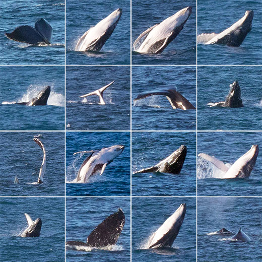
Making a grid turned a bunch of poor quality images into something more interesting
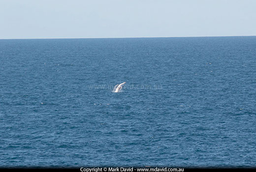
I was standing at a lookout in SE Queensland, hoping to photograph sea eagles, but there weren’t any sea eagles around. However a long way offshore, a large pod of Humpback Whales started breaching. Despite the enormous size of the whales my 400 mm lens was insufficient to get anything but very small images of them. Here is what the images typically looked like when you saw the whole frame. Even at full resolution, the whales looked tiny.

There’s not much to get excited about a whale image when it looks like this.
I took dozens of photos, firing off a burst of shots whenever I saw distant splashing, and when I looked at the shots onscreen back at home I was surprised that I had actually caught some nice action. But the whales were so far away they looked tiny. What to do with such tiny images?
At design school I learned an old trick you can use if you have lots of small images. For example, if you’re designing a brochure and you need to show dozens of sponsor logos, things can look pretty messy pretty quickly. So designers often put things like that into a grid. It turns out that putting these tiny whale photos in the grid made the action look so much closer, because the tiny whale images easily filled the tiny squares. People saw my grid and thought the whales were almost landing in my lap. But they weren’t. It’s just the magic of grids.


