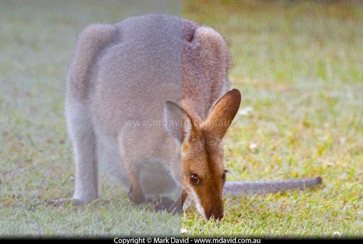
On the left, the image is tinted a bit blue and the dirty glass has stripped out all the contrast. On the right the image has been improved in the RAW editor.

Windows in houses are good, right? I mean, nothing disappoints like a solid brick wall for photographing things happening outside. Problem is, windows can disappoint too if they aren’t perfectly clean. This photo for example, was taken through a very dirty window at a wallaby which, to make things worse, was in very weak early-morning light. In fact the sun hadn’t even properly come up yet (that’s when you see the most wallabies). Yet I was able to salvage quite a lot from it by pulling a few sliders in my RAW editor.
Because the light was still so weak outside, the first thing I did was to crank up the ISO to 1,250 to help the camera brighten things up a bit. Otherwise the shutter speed would need to slow down too much and I most likely would have ended up with some camera-shake blur. Then I opened up the aperture as much as that lens could manage (f/5.6). To get around the problem of smears of dust and dirt on the glass I put the lens right up to the glass. That allowed the dirt spots to be so close that they completely blurred away to invisibility by being so badly out of focus. (See what I did there? I just saved you all that time cleaning your windows. I like to think this website is full of time-saving tips like that.)
The resulting shot lacked contrast, thanks to the dirt on the window filtering it out. And everything looked a bit blue too, thanks to the early morning shadows and also the very slight blue-greenish tinge in the glass. But we’re not finished with it yet.
I’ve loaded the file into my RAW editor now. I use Adobe Lightroom but other RAW editors will let you do this stuff too.
My first step is always to correct the colour temperature. That’s what I’ve done here. You see, deep shadows, especially early in the morning, have a bluish tint to them. And glass has a greenish-blue tint. So I needed to drag the colour temperature slider in the RAW editor a tiny bit to the yellow (warm) side to make it look less blue. But go easy with that slider. Drag it too far and your whole image could end up looking like an awful mustardy yuck.
Drag the ‘whites’ slider to make whites brighter until proper whites start appearing. In Lightroom you can hold down the Option key (or the Alt key for you Windows folks) while you drag to the right. The image goes black but the first little spots of detail appear in the highlights when you’ve dragged the slider enough. Let go of the Option/Alt key to see what you’ve done.
Now drag the ‘blacks’ slider to make proper blacks. Once again, in Lightroom you can hold down the Option/Alt key and then drag to the left. The image goes all white and you drag until the first patches of deep shadow shapes start appearing. Let go of the Option/Alt key and see if you like it. If it looks too contrasty then this time, without holding the Option/Alt key down, drag the black/white sliders back a little bit closer to their original centre positions until you like what you see.
The finished image isn’t as nice as if it had been taken it in beautiful light, but it sure has improved since we started. So don’t worry if your through-a-window shots look as bad as my one did. Chances are there’s a lot of image quality you can salvage from them.
Copyright © Mark David. All rights reserved | Mark David on Google+